Data visualization is an essential skill for running any enterprise that is driven by data. It transforms data into images, making it simpler to comprehend, assimilate, and base crucial business decisions on the information. Data visualization generates insights that your team may not have uncovered any other way.
Data scientists must often perform tasks such as the analysis, interpretation, and visualization of massive datasets. Because of this, they need to have access to the appropriate tools for data visualization at their disposal
People who do not work closely with data may have a tough time understanding data visualization.
The majority will not be able to understand words written down or an Excel spreadsheet full of figures with no context whatsoever.
The tools for data visualization enable data scientists to more effectively explain their findings. This is significant because it enables them to share their insights with other individuals.
In this post, we will examine some of the best tools for data visualization, as well as how these tools can successfully boost the efficiency of data scientists.
What is Data Visualization?
The graphical depiction of information and data is what is known as “data visualization.” Data visualization tools make it possible to quickly see and comprehend patterns, outliers, and trends in the data. This occurs through the utilization of graphical elements such as charts, graphs, and maps.
In the realm of Big Data, data visualization tools and technologies are indispensable for conducting in-depth analyses of data. Upon the analysis of these data, conclusions become very visible.
You Should Check Out These: Best Tools for Data Analysis in 2022 | Best Tools
What are the Different Types of Visualizations?
Of course, seeing data visualization is one of the finest methods to understand it. What a bizarre idea! It can be difficult to know where to begin with so many public data visualization galleries and data available online.
We have compiled the best data visualization examples of all time, including analyses of film scripts, among other things.
Tableau’s public gallery showcases a variety of visualizations created with the free Tableau Public tool. They offer some basic business dashboards as templates, and Viz of the Day showcases some of the greatest community efforts.
There is also a plethora of fantastic examples, explanations, and information on best practices for data visualization.
Check Out: Best Data Analysis Courses with Certification in 2022
They Include But Are Not Limited To;
- Charts
- Tables
- Graphs
- Maps
- Infographics
- Dashboards
More specific examples of methods to visualize data:
- Area Chart
- Bar Chart
- Box-and-whisker Plots
- Bubble Cloud
- Bullet Graph
- Cartogram
- Circle View
- Dot Distribution Map
- Gantt Chart
- Heat Map
- Highlight Table
- Histogram
Read Also; 10 Best Data Structures and Algorithms Course
What are Tools for Data Visualization?
The tools for data visualization make it simpler for data visualization designers to create visual representations of extensive data sets. This makes the use of tools for data visualization increasingly important.
When working with data sets that contain hundreds of thousands of data points, automating at least part of the process of creating a visualization makes the job simpler.
After that, we can put these data visualizations to use for a variety of purposes, including dashboards and yearly reports. People use them in sales and marketing materials and investor slide presentations.
See Also: Best Online Data Science Courses To Take In 2022
Why Use Data Visualization Tools?
The brain processes images and other forms of visual data 60,000 times more quickly than text-based data or information. Therefore, data visualization tools allow you to take advantage of the way the human brain functions.
Data visualization has a wide variety of applications, some of which are corporate intelligence, the comprehension of marketing campaigns, the prediction of purchasing behavior, and the production of infographics.
The most effective and efficient approach to conveying complicated information is through the use of visuals. Consequently, if any of the following are of interest to you, it is prudent to invest in a data visualization tool:
- Increasing both the quality and speed of one’s business decisions
- Your company will benefit from time savings and increased productivity.
- Observing purchasing patterns to increase your company’s bottom line
- Determine fast which regions are problematic and where the bottlenecks are.
- Having a comprehensive understanding of enormous amounts of data collected from different channels
- Bringing your business’s systems and procedures into better alignment.
- The dissemination of information through the use of visuals
- There is a good chance that your company can make use of at least one of those.
Having said that, the prices of some of the basic tools for data visualization on this list can be steep. Before you make any choices, check that you have a good understanding of what you require and what is unnecessary. If you do not have a use for a specialized tool, there is no use in splurging on one.
And if money is tight for you, many of them have free-forever options that you may sign up for. That way, you can start up right away, test it out without spending any money, and then switch to a premium plan whenever you feel the need to.
Read Also: 10 Best Data Science Internship and Training 2022
What Do the Best Data Visualization Tools Have in Common?
The most effective data visualization tools currently available share a few characteristics in common. To start, they are really simple to use. There are several programs available for viewing data that are extremely intricate in their design. Some of them come with comprehensive documentation and instructional videos, in a way that makes using them feel natural to the user.
Because other tools for data visualization fall short in these categories, it is impossible to include them on any list of “greatest” instruments, regardless of the other skills they may possess.
The most effective data visualization tools can manage very large data collections. Although the very finest ones can process numerous data sets simultaneously within a single visualization.
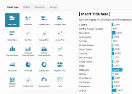
These tools also can generate a wide variety of charts, graphs, and maps. The majority of the following tools are capable of producing both static images and dynamic, interactive graphs. There are, however, deviations from the several output criteria that can be found.
Data visualization tools concentrate on a certain kind of chart or map and perform exceptionally well in that area. These tools deserve a spot among the “greatest” ones that are currently available.
The final factor to take into account is the budget. Even though a higher price tag does not inherently exclude a tool, you can justify the higher price tag by greater support, better features, and better overall value.
Read Also: What Can I Invest In With 100 Dollars? An Expert Advice in 2022
Best Data Visualization Tools for Every Data Scientists
To get right down to business, the following is a list of the top 10 best tools for data visualization for data scientists that we have:
- Tableau – A popular and well-established data visualization tool
- QlikView
- Excel – An entryway to the world of data visualization software
- Microsoft Power BI – Microsoft’s main data is offering
- Datawrapper
- Plotly
- Sisense – Innovative functionality and handy features
- Zoho Analytics – A go-to tool for marketers and salespeople
- DataWrapper – Straightforward, code-free charts and maps
- Fusion Charts – Extensive options for visualizing your data
Also, Check-Out: How Can I Become a Data Scientist? Cost, Salary, Careers
#1. Tableau
Tableau ranks first in our list of the best tools for data visualization. You can utilize Tableau for creating interactive graphs, charts, and maps. It lets you connect to a variety of data sources and quickly build visuals.
It is also possible to collaborate with others and share your work.
Originally, Tableau Desktop was the only option available. You can publish static visualizations on one or more web pages, but it does not provide interactive maps.
Tableau Public is a limited-featured version of the desktop software that is available for free.
It takes time and effort to become proficient using Tableau, but there are many tools available to assist you. As a data scientist, Tableau should be your primary tool for learning and using.
Highlights of Tableau’s Capabilities:
- When it comes to data visualization, Tableau is widely regarded as the most user-friendly business intelligence solution available.
- This technology does not require data scientists to create their code.
- In addition to data mixing, the tool allows for real-time communication.
Read Also: 15 Free Online Stock Portfolio Trackers in 2022
#2. QlikView

As a tool for data visualization, QlikView helps customers to make faster and more informed decisions.
QlikView helps in accelerating analytics, uncovering new business insights, and improving the accuracy of findings.
For many years, companies all around the world have relied on this user-friendly software development kit. With QlikView, a variety of data sources and visualizations, such as bar graphs, line graphs, pie graphs, and sliders, can be put in place.
Allows users to input data from a variety of sources, such as databases and spreadsheets, without writing any code. Because of these features, it is a lot simpler to pick up and use.
QlikView’s most important features:
- This tool supports Impala, HP Vertica, EC2, and many other data sources.
- Performing data analysis using it is lightning fast.
- Easy to use and customizable, this data visualization tool is ideal for a wide range of applications.
#3. Microsoft Power BI
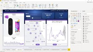
Microsoft Power BI is a data visualization tool that is typically utilized for the analysis of data about business intelligence. Reporting, analytics as a self-service, and predictive analytics are all possible with this tool.
To fulfill their requirements for business intelligence, more than 200,000 different companies are currently utilizing this product.
In addition to this, it gives the end-user a platform on which they may generate reports. Upon the successful generation of reports, they can share their findings with others in their organization. It functions as a centralized repository for all of your company’s data. Good thing is that all of your company’s users can access the data stored there.
Added to all of these features, Power BI also offers connections with a variety of other SaaS products. These products include Google Analytics, MailChimp, Office 365, and many others.
Because you can share the prepared reports inside the business, it is a very significant tool for enterprises who are searching for a centralized data reporting solution.
The following is a list of key features of Microsoft Power BI:
- Generate dynamic data visualizations across various data centers
- On a single platform, it provides data analytics for enterprises in addition to self-service options.
- Making machine learning models is so simple that anyone, not only data scientists, can do it.
#4. Datawrapper
Datawrapper is a data visualization tool that is accessible online as well as in a variety of settings. It has a user interface that is streamlined and straightforward, and it is very simple and straightforward to use.
Users can construct charts and maps directly in the browser using Datawrapper by uploading the data files that they need to use. You can generate responsive maps and charts with Datawrapper and make use of them in building a wide variety of devices. With this, readers will be able to view them on any device that they happen to be utilizing.
Everyone can use Datawrapper at no cost; however, the free version does have some restrictions.
For instance, you can only upload 500 rows of data and one sheet (or 5 megabytes) of data at a time using this feature. Aside from this,.you can generate line, bar, area, column, pie, and scatter charts using this tool.
The following is a list of the primary capabilities of Datawrapper:
- It provides users with an embed code and also gives users the ability to export charts. Additionally, it gives users the option to select multiple map types and charts all at once.
- It is not necessary to have an in-depth understanding of coding to install the tool.
5. Plotly

Plotly is a platform for data visualization that allows users to build interactive graphs, charts, and maps from their data. You may also use Plotly to generate a visualization of a dataset. Good thing is that you can share the link to that visualization with the followers of your social network accounts.
Plotly’s graphs are interactive and come with a custom URL, making it simple for users to distribute and discuss their work. By hovering over data points and viewing information about them, readers can investigate them.
Readers are also able to examine all the data interactively, rather than attempting to comprehend your code. With this feature, it is ideal for sharing interactive graphs as well as datasets with your audience.
Because of Plotly’s intuitive user interface, it is possible to produce stunning graphs in less time than was previously possible. In addition, Plotly comes equipped with a sizable library of open-source visualization types. This would give you access to a wide selection of plots and maps to select from.
Plotly’s key features are as follows:
- It has permissions and interfaces with SAML right out of the box.
- The deployment of the data visualization tool is lightning fast and very simple.
- Users have access to the platform to facilitate rapid exploration and prototyping.
Read Also: 20 Best Investment Tracking Software in 2022 | Expert Guide
#6. Sisense

Sisense is a data visualization application that makes it simple to produce dynamic visuals based on your data using the data you provide. You may quickly and simply develop large and informative dashboards with the help of Sisense. This will assist you in gaining a better understanding of your data.
It has a very powerful yet simple and intuitive interface that enables you to drag and drop your data onto the canvas and create visualizations with just a few clicks of the mouse. This makes it possible for you to quickly analyze large amounts of data.
In addition to this, it has full integration with several business intelligence tools, including Microsoft Excel, BIRT, Qlikview, and Tableau.
The technology that Sisense employs is multi-dimensional in-memory computing for big data. In addition to that, it incorporates an artificial intelligence engine with predictive analytics. Doing this makes it simple for you to visualize data trends and unearth previously hidden patterns in your data.
The following are the primary characteristics of Sisense:
- Provides users with a variety of tools to comprehend the data that has been collected in a graphical format.
- You can link directly to numerous data sources at once
- Data scientists can connect a wide variety of maps and charts with the help of this application.
#7. Excel
Because Microsoft Excel’s user interface is straightforward, using the program to visualize data does not need to be a challenging experience for the user.
Excel’s data visualization capabilities are quite diverse and flexible. Scatter plots are one method, and they show the relationship between two datasets that you want to compare. There are a few different ways to do this, but one of them is to use scatter plots.
You may also assess whether the variables are together by looking at how they are related to one another. Therefore, determining whether there is a connection between them.
The analysis of statistical, scientific, medical, and economic data, as well as data used for objectives such as market research and financial planning, is something that many data analysts do with the help of scatter plots.
Related Article: 10 Best Tools for Hacking in 2022 | Best Tools
#8. Zoho Analytics
Zoho Analytics is a data visualization and reporting solution that enables you to quickly generate individualized reports. You can do the following with Zoho Analytics:
- Drag-and-drop functionality makes it easy to quickly generate individualized reports and dashboards.
- Utilizing interactive charts and graphs can help you gain insights into your data.
- Simply click a few buttons to quickly and easily share data and dashboards with coworkers or clients.
Aside from this, it is a part of the Zoho Office Suite, which also contains Zoho Writer, Sheet, and Zoho Show. In addition to this, it has many other features. You may generate reports on data drawn from any of these programs as well as from other sources like MySQL, SQL Server, Oracle, and Google Sheets by utilizing Zoho Analytics.
#9 Visme

Visme is a brilliant online tool that enables you to create a wide variety of dynamic documents to accurately and engagingly present your data.
This platform offers a one-of-a-kind combination of accessibility and scope, making it possible for anyone to create visuals that are crisp and professional. Its extensive library of graphics, templates and stock images provides this combination.
It is highly recommended that professionals look into this if they have an interest in attempting some new approaches to data visualization.
RELATED ARTICLE: 30 Best Marketing Certifications That Are Worth The Money
#10. FusionCharts
The charting capabilities of JavaScript form the foundation of FusionCharts. This visualization tool has solidified its position as one of the industry leaders in recent years.
It is capable of producing 90 different kinds of charts and interfaces. With a wide range of different systems and frameworks, it provides a significant amount of versatility.
One of the things that set FusionCharts apart from other tools for data visualization is the fact that it can build any kind of display from the ground up. Customers also have the opportunity to select a template from a variety of “live” examples that are already in use.
Key features of FusionCharts include the following:
- It offers helpful hints and tooltips to users to facilitate their work.
- The application guarantees that users can comprehend the various functionalities.
- You can examine how the values of the various data points compare with one another.
Conclusion
In today’s environment, we can find virtually anywhere data. Businesses need to can decipher this data and efficiently convey their message.
And for data scientists, learning and keeping up with all the latest data visualization tools is of the utmost importance. It is only after they have mastered this art that they will be able to keep up with the fast-moving realms of artificial intelligence.
Frequently Asked Questions
The act of presenting data in a visual format, such as graphs, charts, and maps, is data visualization. Making data-driven judgments is now easier because of this. Data visualization is a technique for presenting information more understandable and appealing.
Although there are a wide variety of data visualizations, some of the most common are bar charts, pie charts, and line graphs; scatter plots; tree charts; polar graphs; radar polygons; choropleth maps; timelines; and PERT charts.
It all depends on whoever you ask. In addition to graphs, charts, and maps, it has a wide range of graphic options. Data visualization tools help in Importing data from Excel. Data visualization professionals, on the other hand, believe Excel to be more of a data management tool.
Charts (line, bar, or pie), plots (bubble or scatter), diagrams, maps (heat maps, geographic maps, etc.), and matrices are some of the data visualization tools available. To suit unique data visualization requirements, designers might employ a variety of variations on these specific methodologies.
It is nearly hard to detect useful information or make conclusions from large data sets unless some kind of visualization is used, whether it is a simple graph or an interactive dashboard.
It is nearly hard to derive meaningful conclusions from enormous data sets without the use of data visualizations. Designers may help stakeholders better comprehend data by implementing data visualization techniques.
References:
- Interaction-design.org – 5 great Data visualization tools
- Towardsdatascience.com – 8 Best Data Visualization Tools that Every Data Scientist Should Know.
- Simplilearn.com– Top 15 Data Visualization Tools For 2022.
- Online.hbs.edu – Top Data Visualization Tools For Business Professionals


