When it comes to document formatting in Microsoft Word, the choice of fonts and font sizes plays a crucial role in readability and aesthetics. While most users are familiar with setting font sizes within the range of 8 to 72 points, there’s often curiosity about the lower limits—specifically, the smallest font size that Word allows.
In this exploration of Word’s typography capabilities, we delve into the world of the “smallest font in Word” to uncover the practical constraints and creative opportunities it presents. Whether you’re a designer looking for unique text effects or simply intrigued by Word’s font size boundaries, this guide will shed light on the minimum font size and how it can be leveraged for your document needs.
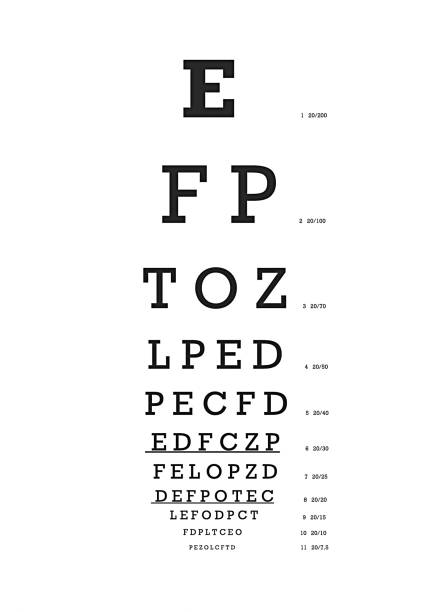
The smallest Font You Can Read?
In Microsoft Word, fonts can indeed be sized from 1 point to 1,638 points, but practical considerations for readability come into play when choosing small fonts. Point sizes smaller than 6 are generally too small for comfortable reading.
For body text or small font sizes, it’s essential to select a typeface that is highly legible at those sizes. Fonts like Sitka Small and Verdana are excellent choices because they are designed to maintain readability even at tiny text sizes.
Another noteworthy option is Bell Centennial, which was specifically created for phone books, where legibility is crucial despite the small print size and the limitations of printing and paper quality.
What is the most Readable Font in Word?
Calibri is indeed a widely recognized and used sans-serif font. It became the default Microsoft Word font, replacing Times New Roman, due to its modern and clean design. Calibri is known for its readability on screens and in printed documents, making it a safe and accessible choice for various purposes, including business documents, presentations, and academic papers. Its contemporary appearance and legibility contribute to its popularity as a default font in Microsoft Word.
What Age Are Most Seniors in High School? (New Update)
What is the Easiest Font for Seniors to Read?
For older individuals, it’s crucial that the serif font maintains a uniform stroke width, avoiding fluctuations between thick and thin lines that may lead to visual discomfort.
Sans-serif fonts such as Arial or Helvetica are a suitable option, as they possess a clean and legible appearance, particularly for brief pieces of content like headlines.
Which Font is most Pleasing to the Eye?
Designed for Microsoft, Georgia was actually created with low-resolution screens in mind, so it’s ideal for your desktop and mobile site visitors alike:
- Helvetica.
- ‣ PT Sans & PT Serif.
- ‣ Open Sans.
- ‣ Quicksand.
- ‣ Verdana.
- ‣ Rooney.
- ‣ Karla.
- ‣ Roboto.
What are the Four Major Font Types?
What are the four main types of fonts?
- Serif fonts.
- ‣ Sans serif fonts.
- ‣ Script fonts.
- ‣ Display fonts.
Is 72 the largest font in Word?
While working on specific document types using Microsoft Word, you might encounter a sense of restriction in your design options due to the seemingly modest “maximum” font size of 72pt. Nonetheless, it’s important to note that this size isn’t the true upper limit for text in your document; rather, it represents the smallest size listed.
What Is The Largest Font Available In Word?
In Microsoft Word 2010, the font size listed in the dropdown menu reaches a maximum of 72. Nevertheless, you have the flexibility to manually input a font size of up to 1638.
What is the Biggest Font Style in Word?
While crafting specific types of documents in Microsoft Word, you might encounter what appears to be a constraining “maximum” font size of 72pt. Nevertheless, it’s essential to note that this is not the true upper limit for text size within your document; it is simply the smallest size listed in the options.
Which is Easier to Read Arial or Calibri?
Some argue that serif fonts, with their distinctive strokes, are easier to read compared to sans serif fonts (those without strokes, like Arial or Calibri).
How Much Does A Tanning Bed Cost? (20 Examples)
Conclusion
while Microsoft Word’s default font size selection may seem limited with a maximum of 72 points, it’s important to note that this is not the actual upper limit. By manually entering font sizes, you can go beyond this constraint, opening up more design possibilities for your documents.
Whether you’re using a serif or sans-serif font, understanding how to manipulate font sizes gives you greater control over your document’s appearance and readability. So, don’t let the seemingly small maximum font size deter your creativity in Word; explore the options, experiment, and design with confidence.