You’d agree that fonts play a huge part in how we see things, right? Just like picking out a cool t-shirt that says “I’m awesome,” the font in your emails tells a lot about you. It’s like the voice of your words on the screen.
Some fonts are like a friendly hello, making your email feel warm and inviting. Others are all serious business, like wearing a suit to a meeting. And just like in a superhero movie, where the wrong costume can be a bit funny, the wrong font can make your email look a bit off.
So, let’s get ready to pick the superhero costume for your words, and explore the world of fonts where each one has its superpower to make your emails look just right!
Table of contents
- What is the most attractive business font?
- What is the most professional font for business letters?
- Best font for business email
- How to choose the best font for business email
- Best font size for business email
- What is the correct and standard font size and spacing for business letters?
- How many fonts should a business use?
- FAQs
- Conclusion
- References
- Recommendations
What is the most attractive business font?
The most attractive business font is often considered Helvetica due to its universal appeal and professional appearance. Helvetica is renowned for its clean, modern design, offering a balance of style and clarity that is essential in business communications.
Its popularity stems from its versatility – it’s equally effective in headlines and body text, making it a reliable choice for various applications. The uniformity of its characters ensures easy readability, which is crucial in maintaining the reader’s attention.
Its simplicity, coupled with an air of sophistication, makes Helvetica a go-to font for businesses aiming to convey a message of reliability and professionalism.
This font’s popularity in corporate branding and digital communications underscores its effectiveness in engaging audiences while maintaining a serious tone.
Read: 15 Best Free Font Apps For iPhone | All You Need to Know
What is the most professional font for business letters?
Times New Roman is widely regarded as the most professional font for business letters. Its traditional, clear style conveys seriousness and formality, making it a staple in corporate and legal documents.

This classic serif font is a top choice for ensuring that business communications are presented with a respectable and authoritative tone.
Best font for business email
Selecting the right font for business emails is crucial for readability and professionalism. Here are 10 of the best fonts for business emails:
Arial:
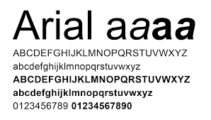
Arial is highly favored for its simplicity and clarity. Its clean, sans-serif design ensures that your emails look professional and are easy to read, making it an excellent choice for clear communication in business settings.
Verdana:

Verdana’s wide letterforms and ample spacing make it exceptionally legible on screens. This sans-serif font prioritizes clarity and readability, making it perfect for digital communication in business.
Helvetica
Helvetica is known for its modern and professional appearance. Its clean lines and versatility make it a popular choice for business emails, ensuring that your messages look polished and uncluttered.
Times New Roman:
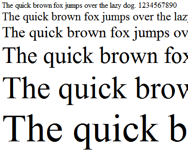
Times New Roman is a classic serif font that exudes tradition and formality. Its timeless appeal and authoritative feel make it a preferred choice for serious business correspondence.
Calibri:
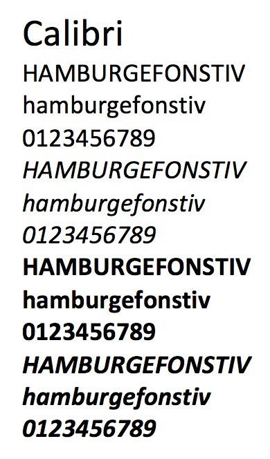
Calibri’s warm and soft character, combined with its sans-serif design, provides a comfortable reading experience. It’s an inviting font that ensures your emails are easy on the eyes, especially during extended reading sessions.
Also, read: How Much Does Email Marketing Cost
Georgia:
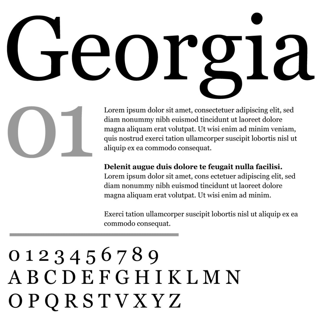
Georgia is a serif font designed for readability on screens. Its elegant and professional appearance makes it suitable for business emails, particularly when you want to convey a sense of classic style.
Tahoma:
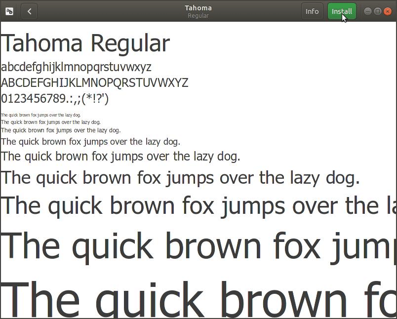
Tahoma, like Verdana, is a sans-serif font optimized for screen legibility. Its narrower body compared to Verdana ensures a clear display, making it an ideal choice for digital business communication.
Lato:
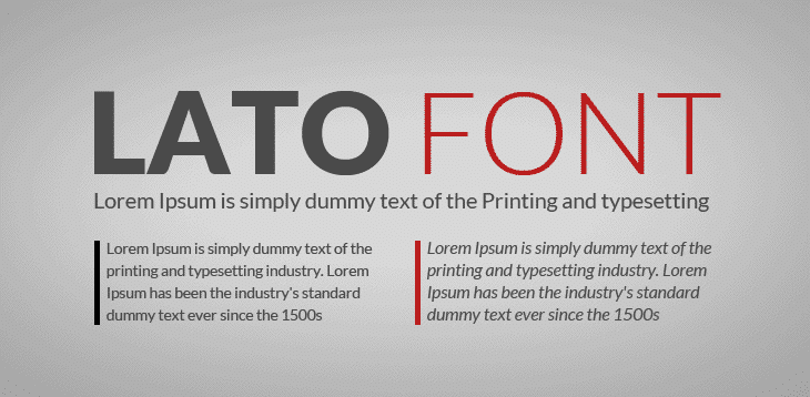
Lato’s modern sans-serif style strikes a balance between professionalism and friendliness. Its contemporary appearance adds a touch of warmth to your emails, making it a versatile choice for various business contexts.
Open Sans:
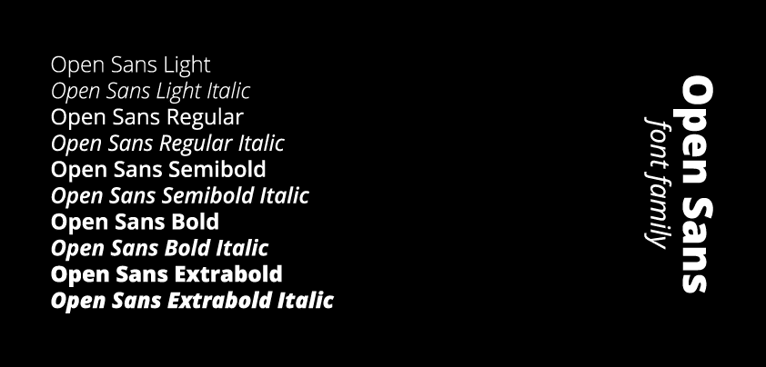
Open Sans is known for its clean and straightforward sans-serif design. Its readability and contemporary look make it a reliable option for business emails that need to convey a clear and modern message.
Roboto:
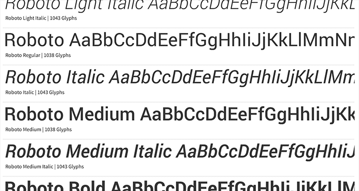
Roboto’s natural reading rhythm and uniformity make it an excellent choice for both print and digital media. Its modern sans-serif style ensures your emails maintain a polished and professional appearance.
How to choose the best font for business email
Choosing the best font for business email is essential for effective communication. Here’s how to make the right choice:
- Readability: Prioritize fonts that are easy to read, especially on screens. Sans-serif fonts like Arial and Helvetica often work well for this purpose.
- Professionalism: Consider the formality of your emails. Serif fonts like Times New Roman and Georgia convey a traditional and professional tone.
- Brand Consistency: Ensure your chosen font aligns with your brand’s style and identity. Consistency in font usage reinforces your brand image.
- Legibility at Different Sizes: Test the font’s legibility at various sizes, as emails can be viewed on different devices. A font that remains clear and sharp at both small and large sizes is ideal.
- Accessibility: Choose fonts that are accessible to a broad audience, avoiding overly decorative or complex styles that may hinder readability for some recipients.
- Compatibility: Check that the font you select is widely supported across different email clients to ensure your message appears as intended.
- Testing: Experiment with different fonts and ask for feedback to determine which one best conveys your message and engages your audience effectively.
Also, read: What is a Press Release? How does it Affect a Business
Best font size for business email
The best font size for business email is typically between 10 and 12 points. This size strikes a balance between readability and professionalism. A font size of 10 points is often considered standard for body text, ensuring that your email is easy to read without appearing too large.
However, if you want to prioritize readability, especially for recipients who may have difficulty reading smaller text, you can opt for a font size of 12 points. It’s essential to maintain consistency in font size throughout your email to provide a cohesive reading experience.
Using larger font sizes for headings and important information can help draw attention to key points while keeping the body text comfortably legible.
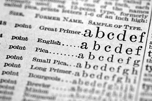
What is the correct and standard font size and spacing for business letters?
The correct and standard font size for business letters is typically 12 points. This size strikes a balance between readability and professionalism, ensuring that your letter is clear and easy to read.
Regarding spacing, business letters typically follow single spacing within paragraphs and double spacing between paragraphs. This format provides a clean and organized appearance to your letter, making it easier for the recipient to read and understand.
Additionally, it’s essential to use a standard font like Times New Roman or Arial, which conveys a professional and formal tone. These choices are widely accepted in business correspondence, ensuring that your letter maintains a polished and credible look.
By adhering to these font size and spacing guidelines, your business letters will present a professional and well-structured image to your recipients.
How many fonts should a business use?
- In business communications, it’s advisable to limit font usage to a maximum of two or three fonts. Using a small selection of fonts helps maintain a consistent and cohesive brand image. Here’s why:
- Brand Consistency: Consistency is crucial for brand recognition. Limiting fonts ensures that all your marketing materials, including emails, letters, and promotional content, share a unified visual identity.
- Professionalism: A limited font palette promotes a professional and polished appearance. Excessive font variation can appear chaotic and unprofessional.
- Readability: Familiarity aids readability. Using a few well-chosen fonts ensures that your audience can easily digest your content without distractions.
- Efficiency: Managing a small set of fonts is more efficient in terms of design and production. It simplifies the creative process and reduces the chance of errors.
By keeping font usage minimal, businesses can present a clear, professional, and recognizable brand image that resonates with their audience.
FAQs
The most professional font for business emails is often considered to be Times New Roman, while the best font size is typically between 10 and 12 points. These choices strike a balance between formality and readability, creating a polished and professional appearance.
The ideal font size for letterhead typically ranges from 10 to 14 points, depending on your design and preferences. This size ensures that your letterhead text is legible and complements the overall look of your business stationery.
Fonts that tend to attract people the most are those that strike a balance between readability and aesthetics. Fonts like Arial, Helvetica, and Georgia often appeal to a wide audience due to their clean, modern, and elegant designs.
Conclusion
Choosing the right font for business communication is a subtle yet impactful decision. It plays a significant role in conveying professionalism, readability, and brand identity. Opting for a standard font size of 12 points and appropriate spacing in business letters ensures clarity and organization. Limiting font choices to two or three maintains consistency and enhances brand recognition. Striking the right balance ensures that your business communications convey a polished and credible image, ultimately fostering trust and engagement with your audience.
References
- zoho.com – email fonts for professionals
- mailmunch.com – Fonts for Email
- mailchimp.com – What is the Best Font for Emails?